How Is Global Biomass Distributed Across The Globe?
MAY 2021
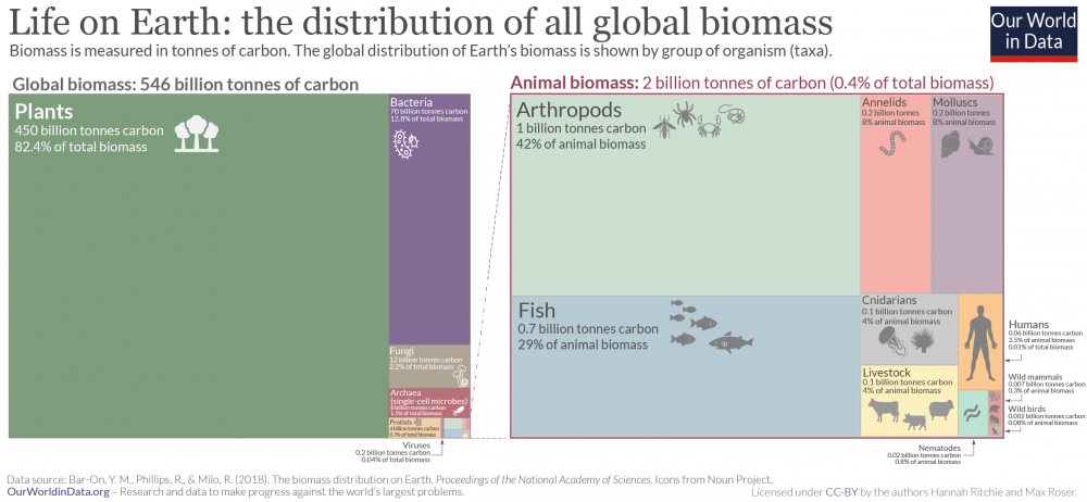
In this graphic, posted to Our World in Data, you are shown what biodiversity is like on Earth and how biomass is distributed between groups of organisms. You also learn about how raising livestock has shifted the balance of animal biomass, what type of environments life is found in, and how many species there are. More information can be found on each category of organisms with links to interactive maps.
When is Milkweed First Sighted Across the States and How Does that Relate to Monarch Butterfly Movement?
APRIL 2021
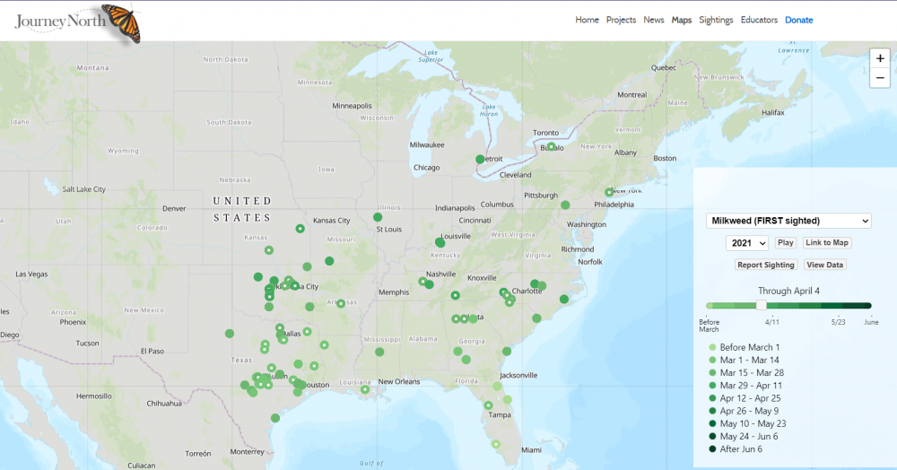
This interactive map, created by JourneyNorth, allows the public to report a sighting of milkweed in their area and adds those sightings to a state map. Sightings of monarch butterflies can also be reported and will be tracked. Many other plants and animal sightings can be recorded on JourneyNorth's page as well. This data allows the public to become citizen scientists as they aid in tracking migrations and seasons across the United States.
How Are Microplastics Getting Into Our Rivers and How Does That Relate to Land Use?
MARCH 2021
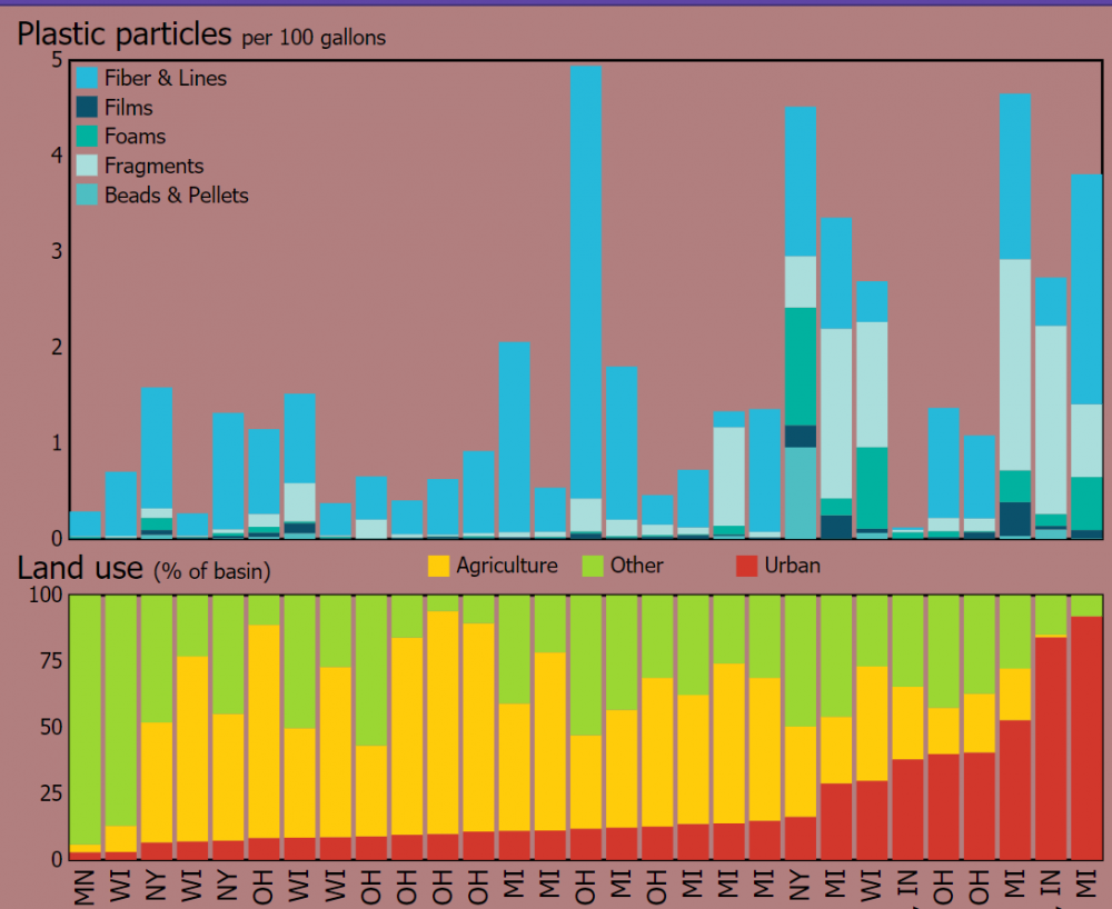
This infographic, created by USGS (U.S. Geological Survey), explores where microplastics are found in U.S. waterways, the known risks of microplastic pollution, and how these plastics are getting into our rivers. Data is also given that compares the microplastics data for the river water samples collected at various locations to land-use types found at those same sampling locations to determine if there seemed to be any patterns in the data.
How Can Technology Be Used to Estimate Snow Cover Around the U.S.?
FEBRUARY 2021
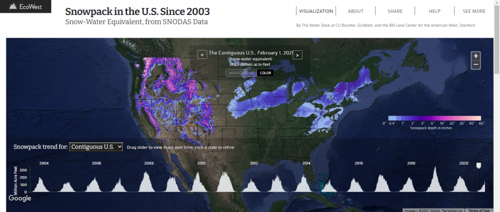
This interactive data visualization, presented by EcoWest, displays data from the National Weather Service's National Operational Hydrologic Remote Sensing Center (NOHRSC) SNOw Data Assimilation System (SNODAS). This system provides estimates of possible snow cover throughout the U.S., as well as previous data of snow cover dating back to 2003. The data can be explored day by day in every location in the U.S.
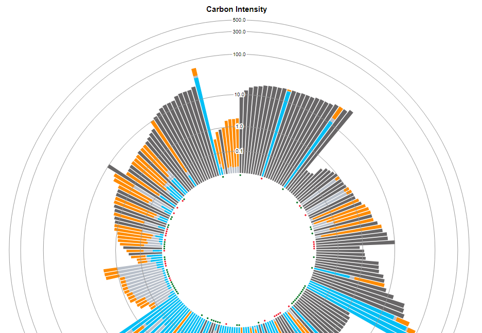
What Are The Carbon Footprints of Popular Products and How Can Companies Lower Emissions?
JANUARY 2021
The Carbon Catalogue, a collaboration between CoClear and SpryGroup, is an interactive data visualization that can give information on the life cycle of over 800 consumer and commercial products made by 145 companies in 28 countries. It includes detailed data about carbon emissions to make each product, and the carbon footprint left behind by each product when factoring in contributions such as upstream, manufacturing (i.e. company-owned facilities), and downstream.