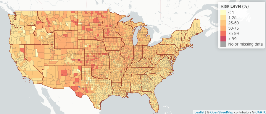
What Are The Risk Levels of Attending An Event During The COVID-19 Pandemic by County?
DECEMBER 2020
This COVID-19 Event Risk Assessment Planning Tool, a collaboration between members at the Georgia Institute of Technology, the Applied Bioinformatics Laboratory, and Stanford University, allows users to investigate the risk level of attending events that vary in size depending on what county is being looked at. The interactive maps share risk estimates about USA counties as well as global estimates. States in the U.S. can be explored in real-time.
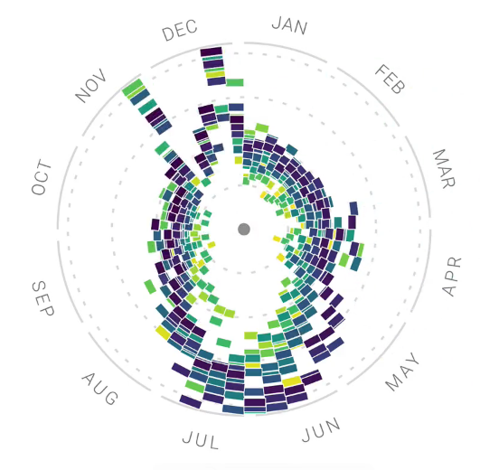
Can Google Search Data Reveal Hidden Patterns in Our Food Trends?
NOVEMBER 2020
This data visualization, which is a collaboration between Google News Lab and Truth & Beauty, gives a detailed look at Google search interest in the United States over the last 15 years related to food. The creators analyzed hundreds of ingredients, recipes, and other food related search terms and compiled them into different graphs that show food search trends in several categories.
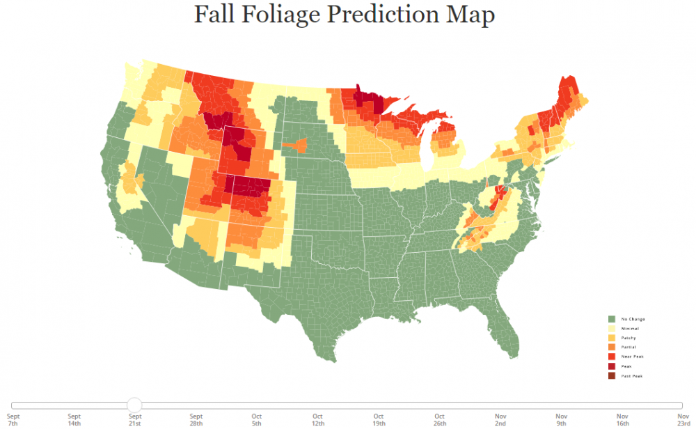
When Will Different States Experience Peak Fall Foliage?
OCTOBER 2020
This interactive map, created by members of the Great Smoky Mountains National Park, was created to show predictions for the annual progressive changing of the leaves in each state. This map highlights when each state will be near or at its peak for fall colors for the year 2020. Information about why leaves change color and why they fall is also included.
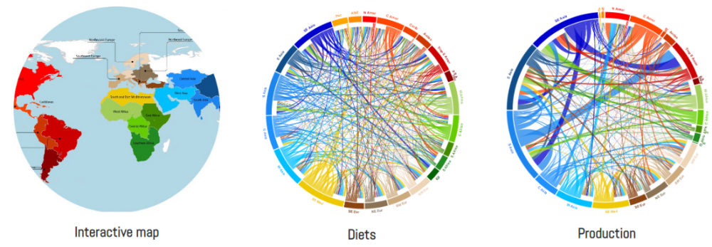
Where Do Our Food Crops Come From?
SEPTEMBER 2020
The interactive map and circular plots below, created by members at the International Center for Tropical Agriculture (CIAT), explore the geographic orgins of crops from around the world. The map shows what regions certain crops originated from, while the circular plots show the link between where crops were initially domesticated and the crops' importance in food supplies today (measured in calories, protein, fat, food weight, etc.). These tools make it easier to visualize what and how food crops connect different regions of the world.
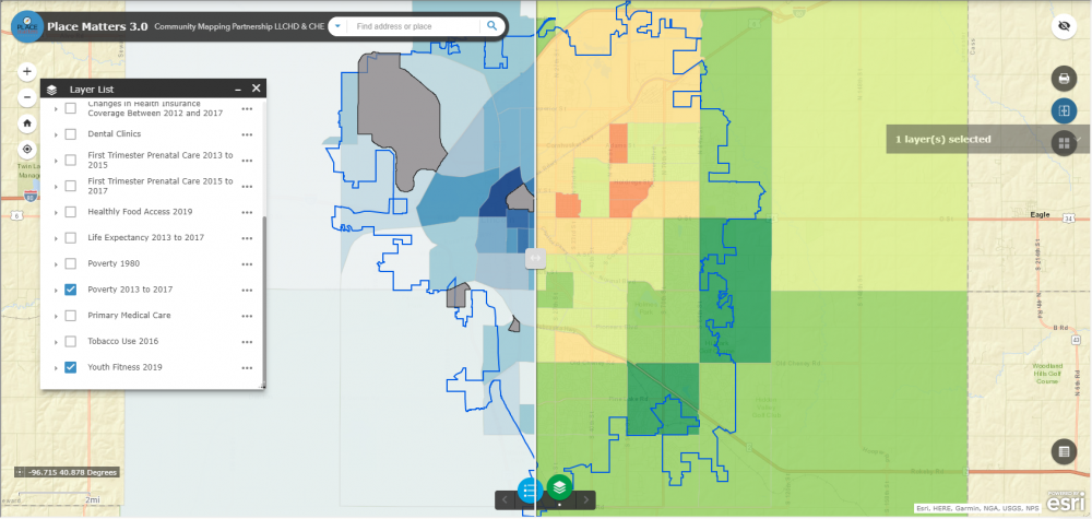
How Is Our Health Related to Where We Live?
AUGUST 2020
Ongoing evidence shows that the community one lives in has a significant impact on their overall health. These interactive maps from the Community Health Endowment of Lincoln, Nebraska show how parts of the city differ in a variety of health factors and outcomes including healthy food access, tobacco use, first trimester care, primary care, dental care and more.