This interactive map comes from The Journey North and shows when milkweed is first sighted in the wild by citizen scientists across the U.S. You can animate the map by dragging the slider along the timeline and pressing play.
Are you curious about how the climate in your area might change over the next 100 years? How hot do you think summers will be? How will rain or snowfall compare to conditions now?
This map comes from work published by The Nature Conservancy. The map shows the average direction mammals (pink), birds (blue), and amphibians (yellow) need to move to find hospitable climates as they shift across the landscape.
Nutrients including nitrogen (N) and phosphorus (P) are contaminants that degrade drinking, irrigation, and recreational waters across the Midwestern United States. These contaminants in high concentrations are dangerous to human health and can cause events like harmful algal blooms. The map below comes from research completed by the mesoLab at the University of Nebraska-Lincoln.
The animation below comes from Robert Rohde, lead scientist with Berkeley Earth. It shows changes in Earth's carbon cycle over time.
Population.io, brought to you by World Data Lab, aims to make demography – the study of human populations – accessible to a wider audience. They believe that demographic data can play an important role in understanding the social and economic developments of our time.
We know that plants and animals require water for survival, but the amount of water needed varies quite a bit depending on the plant or animal. The interactive menu below allows you to scroll through a variety of food choices to create your dinner plate and explore how eating different foods can impact your water footprint.
Food-insecure households are uncertain of having, or unable to acquire, at some time during the year, enough food to meet the needs of all their members because they had insufficient money or other resources for food: 11.1 percent (14.3 million) of U.S. households were food insecure at some time during 2018.
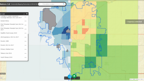
Ongoing evidence shows that the community one lives in has a significant impact on their overall health. These interactive maps from the Community Health Endowment of Lincoln, Nebraska show how parts of the city differ in a variety of health factors and outcomes including healthy food access, tobacco use, first trimester care, primary car
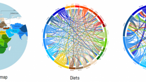
The interactive map and circular plots below, created by members at the International Center for Tropical Agriculture (CIAT), explore the geographic orgins of crops from around the world.

This interactive map, created by members of the Great Smoky Mountains National Park, was created to show predictions for the annual progressive changing of the leaves in each state. This map highlights when each state will be near or at its peak for fall colors for the year 2020.
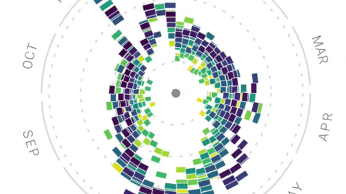
This data visualization, which is a collaboration between Google News Lab and Truth & Beauty, gives a detailed look at Google search interest in the United States over the last 15 years related to food.

This COVID-19 Event Risk Assessment Planning Tool, a collaboration between members at the Georgia Institute of Technology, the Applied Bioinformatics Laboratory, and Stanford University, allows users to investigate the risk level of attending events that vary in size depending on what county is being looked at.
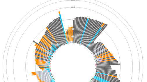
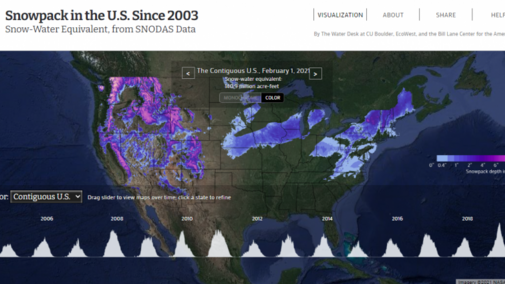
This interactive data visualization, presented by EcoWest, displays data from the National Weather Service's National Operational Hydrologic Remote Sensing Center (NOHRSC) SNOw Data Assimilation System (SNODAS). This system provides estimates of possible snow cover throughout the U.S., as well as p
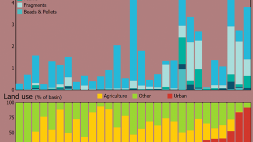
This infographic, created by USGS (U.S. Geological Survey), explores where microplastics are found in U.S. waterways, the known risks of microplastic pollution, and how these plastics are getting into our rivers.
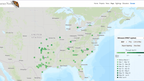
This interactive map, created by JourneyNorth, allows the public to report a sighting of milkweed in their area and adds those sightings to a state map. Sightings of monarch butterflies can also be reported and will be tracked. Many other plants and animal sightings can be recorded on JourneyNorth's page as well.
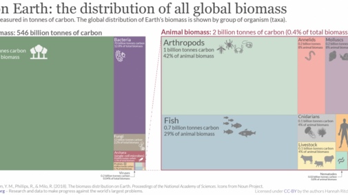
In this graphic, posted to Our World in Data, you are shown what biodiversity is like on Earth and how biomass is distributed between groups of organisms. You also learn about how raising livestock has shifted the balance of animal biomass, what type of environments life is found in, and how many species there are.